
The Home ReStyle Co.
Visual Identity + Spatial Design - (Cleveland, OH, USA)
Overview
The Home ReStyle Co. is a company specializing in light renovations for residential and small commercial spaces—working primarily with homeowners, Airbnb hosts, and real estate professionals who require fast, high-quality aesthetic upgrades.
Erosoma was commissioned to develop a complete visual and spatial identity, translating the company’s values—efficiency, clarity, and quality—into a coherent system spanning branding and interior space.
The Challenge
The Home ReStyle Co. needed an identity that was:
immediately understandable
professional yet approachable
modern, minimalist, and practical
able to communicate trust and competence without feeling corporate
At the same time, their office space had to function as a small creative studio and material library, occasionally welcoming clients while primarily supporting on-site work.Our Approach
We approached the project as a single system, designing brand identity and space simultaneously.
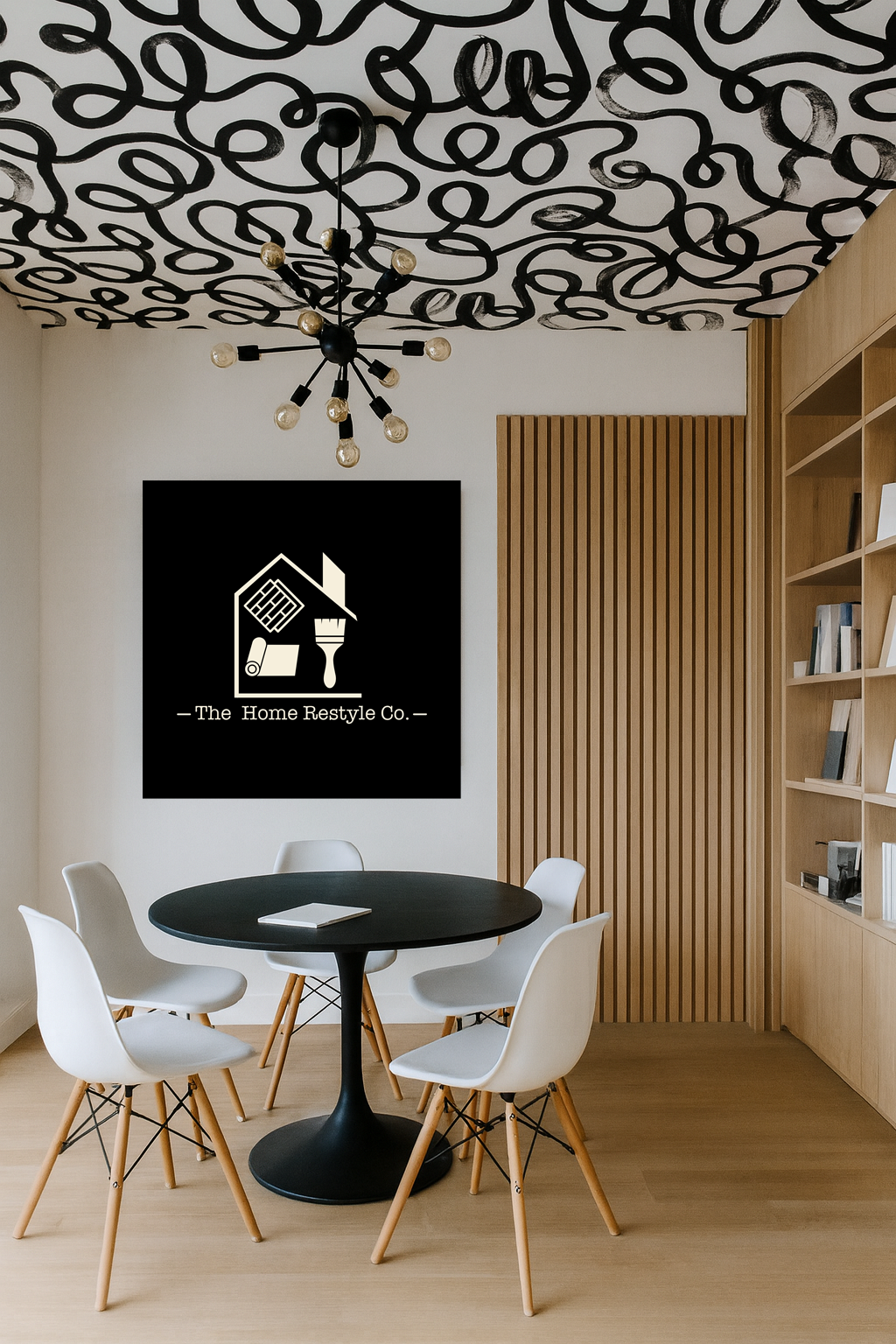
The visual identity was developed around a clear, architectural mark: a simplified house containing tools that represent the company’s core services. The language is restrained, legible, and durable—designed to perform across digital, print, and physical applications.
The interior design extends the same logic into space. Materials, proportions, and details echo the brand’s values, creating an environment that feels calm, efficient, and intentional.
Visual Identity
Clean, architectural logo design
Neutral, professional color palette
Clear typographic hierarchy
Identity designed for long-term use across signage, documents, and digital platforms
The identity avoids decorative excess, prioritizing clarity and recognizability.
Interior Design
The office was conceived as a minimal, welcoming workspace:
White walls and light, neutral finishes
White oak slatted elements for warmth and rhythm
Integrated material library with natural samples
Simple, iconic furniture pieces
Graphic ceiling treatment introducing a subtle artistic layer
A wall featuring the logo anchors the space, reinforcing brand presence without overwhelming it.
Outcome
The result is a cohesive visual and spatial system that reflects The Home ReStyle Co.’s promise: taking complexity and turning it into something clear, efficient, and well designed.
Brand and space work together, offering a professional image that inspires confidence while remaining accessible and human.

The Home Restyle Co.
Client
The Home Restyle Co.
Year
2025