
PetralEat Restaurant

Client:
PetralEat Restaurant
Year:
2025
PetralEat
Visual Identity + Spatial Concept (Spec) - Petralia Soprana, Sicily
Overview
PetralEat is a restaurant located in Petralia Soprana, a small town in Sicily deeply connected to its territory, landscape, and traditions. The restaurant’s cuisine is rooted in local produce and traditional recipes, reinterpreted through a contemporary lens.
Erosoma was commissioned to design the visual identity for PetralEat. Alongside the identity work, we developed a SPEC conceptual interior proposal to explore how the brand could extend into space.
The Challenge
The visual identity needed to:
reflect a strong connection to place
feel authentic rather than folkloristic
balance tradition with a contemporary sensibility
remain understated and durable over time
PetralEat’s identity had to speak quietly, allowing food, context, and atmosphere to remain central.
Our Approach
We approached the project by grounding the identity in the physical and cultural landscape of Petralia Soprana.
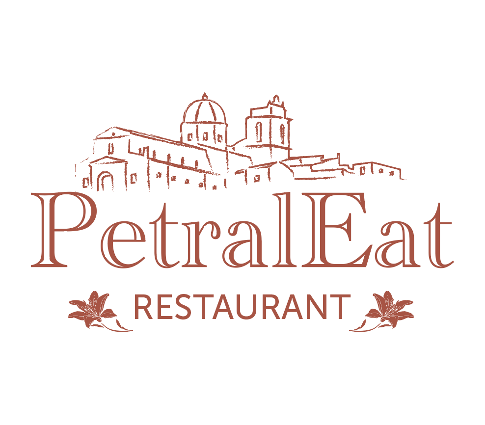
The logo was developed as a simplified skyline of the town, translating its architectural profile into a recognizable and meaningful mark. The color palette was derived directly from the local stone, using a soft ochre tone that evokes the material and light of the surrounding environment.
Alongside the identity, we explored a spatial concept to demonstrate how the same language could be expressed architecturally.
Visual Identity
Logo inspired by the skyline of Petralia Soprana
Color palette drawn from local stone and earth tones
Clean, restrained graphic language
Identity designed to feel rooted, timeless, and context-aware
The result is an identity that feels inseparable from its place.
Spatial Concept (Spec)
Although interior design services were not part of the commission, Erosoma developed a series of conceptual interior visuals to explore how the brand could translate into space.
The proposed atmosphere reflects the same principles as the identity:
cream and off-white tones
stone and textured walls
warm wooden floors
simple table settings emphasizing material quality
The space is conceived as calm and understated, allowing food and social experience to take precedence while subtly reinforcing the restaurant’s connection to its territory.
Outcome
The PetralEat project illustrates Erosoma’s approach to identity as a system—where graphic language, material references, and spatial ideas originate from the same cultural and contextual foundation.
Even when applied conceptually, the spatial exploration reinforces the identity’s narrative, showing how brand and place can speak with a single voice.